Table of Contents
ToggleData Visualization :
Data visualization is the representation of data using common graphics such as charts, diagrams, infographics, and even animations. The visual representation of this information can communicate complex data relationships and data-driven insights in an easy-to-understand manner.
Data visualization is a key step in the data science process, enabling teams and individuals to communicate data more effectively with colleagues and decision makers. Teams managing reporting systems typically rely on predefined template views to monitor performance. However, data visualization is not limited to performance dashboards.
For example, text mining allows analysts to use word clouds to discover key concepts, trends, and hidden relationships within this unstructured data. Alternatively, you can use a graph structure to represent the relationships between entities in your knowledge graph.
Types of Data Visulaization :
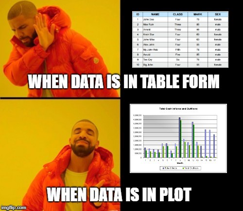
- Tables: These consist of rows and columns used to compare variables. Tables can present a lot of information in a structured way, but they can also overwhelm users who are simply looking for general trends. It is divided into sections representing divisions. It provides an easy way to organize your data and compare the size of each component.
- Line and Area Charts: These visualizations show changes in one or more quantities by plotting a series of data points over time and are commonly used in predictive analytics. Line charts use lines to show these changes, while area charts connect data points with line segments, stack variables, and use colors to distinguish variables.
- Histogram: This chart plots the distribution of numbers using bar charts (no spaces between bars) that represent the amount of data that falls within a particular range. This image allows end users to easily identify outliers within a given data set.
- Scatter Plots: These visualizations help reveal relationships between two variables and are commonly used in regression data analysis. However, they are sometimes confused with bubble charts, which are used to visualize three variables via the x-axis, y-axis, and bubble size.
- Heatmaps: These graphical plot displays help visualize behavioral data by location. This can be a location on a map or a web page.
- Treemap: that displays hierarchical data as a set of nested shapes (usually rectangles). Treemaps are great for comparing proportions between categories based on region size
Benefits of Data Visualization :
Our eyes can perceive colors and patterns, so we can quickly distinguish between red and blue, squares and circles. Our culture is visual and encompasses everything from art and advertising to television and film.
Basic applications of data visualization techniques include:
- A powerful technique for exploring data with presentable and interpretable results.
- In the data mining process, it serves as a major step in the preprocessing portion.
- Supports the data cleaning process by finding bad data and corrupted or missing values.
- It is also useful for constructing and selecting variables. That is, you must decide which variables to include and discard in your analysis.
- It also plays an important role in combining categories in the process of data reduction.

Different types of Data Visualization :
- Univariate analysis: Univariate analysis uses a single feature to analyze almost all its properties.
- Bivariate analysis: When you compare data between exactly two characteristics, this is called bivariate analysis.
- Multivariate Analysis: Multivariate analysis compares two or more variables
Univariate analysis methods for data visualization:
1. Distribution Chart:
- This is one of the best univariate charts known for the distribution of data.
- Distribution plots are often used when you want to analyze the effect of a target variable (output) in relation to an independent variable (input).
- This graph combines a probability density function (pdf) and a histogram in one graph.
Implementation :
Advantages and Disadvantages of Data Visualization :
Our eyes are drawn to colors and patterns. Red and blue, squares and circles are immediately distinguishable. Our culture is visual and encompasses everything from art and advertising to television and film. Data visualization is another form of visual art that captures our attention and keeps the message in mind. Looking at the chart, you can quickly spot trends and outliers. When we can see something, we internalize it immediately. It’s purposeful storytelling. If you’ve ever stared at a huge table of data and failed to spot any trends, you know how effective visualization can be.
Other benefits of data visualization are:
Easy sharing of information. Explore
opportunities interactively.
Visualize patterns and relationships.

